The Price of Looking Cheap It is the price you sell it for.
You may have a great product/service, but if your packaging, your website font, or your business card texture is basic, the potential buyer won't even offer to pay you the price you deserve. "Customers won't pay for a poor quality logo." Your logo is your suit. Our goal is to position your company as a $1 million global giant in the industry.
Perception Management
Blue reflects confidence and gold reflects premium. We strategically choose the angles and colors of your logo based on neuro-marketing dynamics (Consumer Psychology).
Mathematical Scalability
Your logo provides smooth readability, whether on a 1-inch business card, a 10-foot facade sign, or on single-color fax paper (Monochrome).
Brand Guide (Guideline)
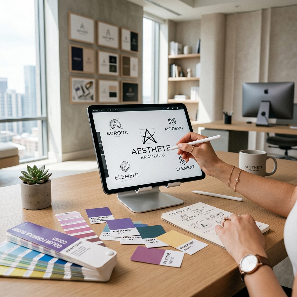
Never let your employees stretch the logo. We are passing on a brand with a constitution, standardized with Pantone codes and corporate font families.
Brand Climate from Scratch (Brand Identity)
We melt name finding (Naming), story telling (Storytelling), logo drawing and all corporate documents in a single aesthetic pot. We inject prestige into newly established brands or brands with an identity crisis.
- Vectorial Emblem Design: Original drawings that are timeless and completely registrable for your company (Trademark).
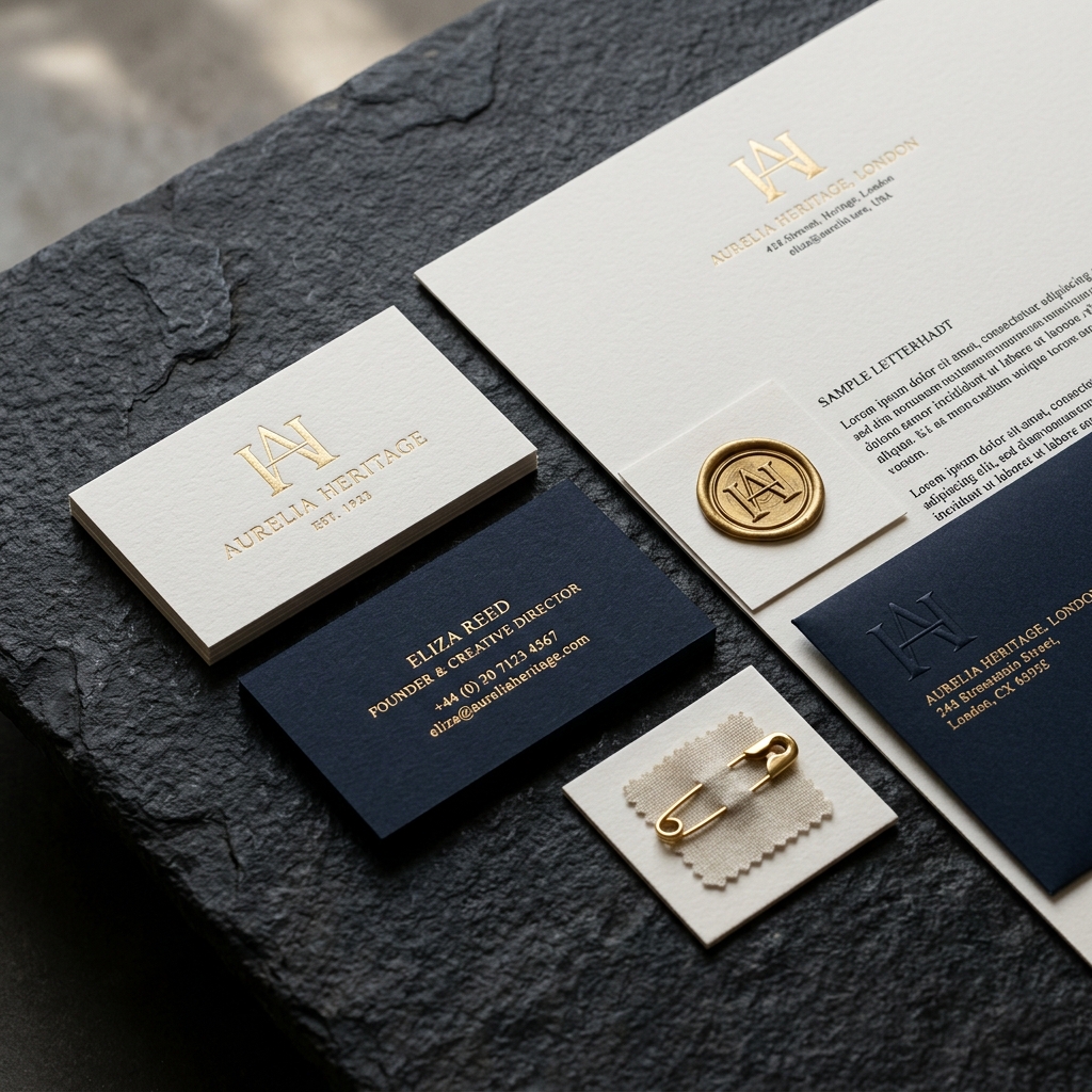
- Corporate Documents Group: Compatibility matrix from letterheads, business cards, invoices/delivery notes, personnel cards and pocket presentation files.
Re-Branding (Regeneration) Transformation
Your company may be a 20-year-old company, but your Paint abandonment Logo from 20 years ago may not appeal to the new generation of consumers. Aesthetic revision operations adapted to the modern (Flat Design) era without losing authority.
- Visual Communication Guide (Brand Guideline): Rulebook explaining how the logo can be used on which backgrounds (Light, dark, etc.) to end the current chaos.
- Packaging Revisions: Perceptual design changes that enable the consumer to reach out directly to your product among the competitors in the aisle.
For Perfect Design Our Strategy Map
We connect artistic chaos to industrial standards.
Discovery and Archetype Determination (Brief)
Your brand's Archetype (Hero, Wise, Fun, etc.) is determined so that you and the agency can speak the same language. Is it the perception of luxury or accessibility that is the target?
Sketch and Moodboard (Inspiration Board)
Basic psychoanalyses of the forms are sketched on paper before moving onto the screen. A Moodboard (Inspiration breakdown) is submitted for your approval to determine the color palettes and the scale of appreciation in the global vision.
Vector Production and Typography Editing
The approved concept is completely cast into smooth, mathematical (Golden ratio) vectors. Logotype and emblem harmony is ensured by matching company-specific licensed font (Typography).
Mock-Up Presentation and Delivery
The logo is not sent to you on a white square; It is presented with Hi-Res Mock-ups that show how it will look on a glass front, invoice, glass, or a metal plate, making your decision easier.
Marble/Natural Stone Exporter
Entering the Italian Market
Problem: The 30-year-old Türkiye-based natural stone giant had to sell cheaply to luxury Italian architects at the Fiera Verona Fair in Italy with the blue marble logo written in standard Arial font.
Our solution: Gold/Onyx Black minimalist emblem inspired by Roman architectural columns, an aristocratic Serif font architecture and luxurious bold catalog presentation. Result: Prices of sales trucks can be increased by 40%.
Corporate Identity and Design FAQ
The science and rules behind design.
A shape drawn alone is not a 'logo', it is just an illustration. In order for the brand to turn into a logo, it needs a 'Brand Guideline' about its color psychology, which font (Typography) it will match, and what proportions it will be positioned on its letterhead or website. Otherwise, your brand will look cheap with different variations that are constantly bent and twisted in the hands of different agencies/employees. That's why we don't sell "just a little logo", we offer a corporate basic package.
If it is done without vision, it will be frightening. All the big giants in the world (Apple, Microsoft, BMW, Shell) renew their logos every 10 years. Re-branding does not mean completely throwing away your old logo, but rather evolving it according to the design and digital screen dynamics of the age. Playing with the saturation of your color tones and making bold and rough text flat and minimal will instantly add prestige to the brand.
Certainly. Our main ethic is to deliver printable High-Res vectors of your logo, color codes and corporate documents (in the form of Ai - Illustrator, EPS, SVG and transparent PNG files) as a Drive or cloud file link along with the brand guide (PDF) during project delivery.